"CIRC US OF CURIOSITY" Video
Behind the Curtain: Designing the Cover of „CIRC US OF CURIOSITY“
A personal note from me.
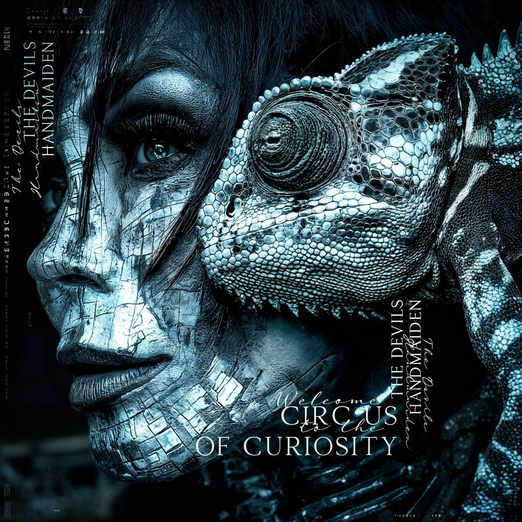
Some covers you design. Others—you live.
The artwork for „CIRC US OF CURIOSITY“ wasn’t born in silence. It came from laughter echoing off studio walls, from spilled coffee on sketch pads, from late-night voice notes that started with “Okay, hear me out…” and ended in wild visual metaphors. It came from friends. From music maniacs. From the kind of people who speak in distortion pedals and poetic chaos.
The title itself—“CIRC US OF CURIOSITY“—was a gift. That typographic fracture between “CIRC” and “US” became our playground. We leaned into it. We let the space between letters breathe. We built a visual language around misfits, mirrors, and myth. Every glitch in the design was intentional. Every shadow had a story.
There were moments when we argued over font weights like they were sacred texts. When someone suggested using a vintage circus poster as a base layer, and we ended up scanning 1930s lithographs in a friend’s attic. When the final color grade was decided over a bottle of wine and a playlist that included everything from Bauhaus to Björk.
It wasn’t clean. It wasn’t linear. It was a circus. And it was ours.
To everyone who sat in those rooms, who sent me cryptic moodboards at 3AM, who believed in the weird and the wonderful—thank you. You’re in every pixel.
This cover isn’t just a design. It’s a memory map. And man—we celebrate.
—WEBSTERIX 🎪